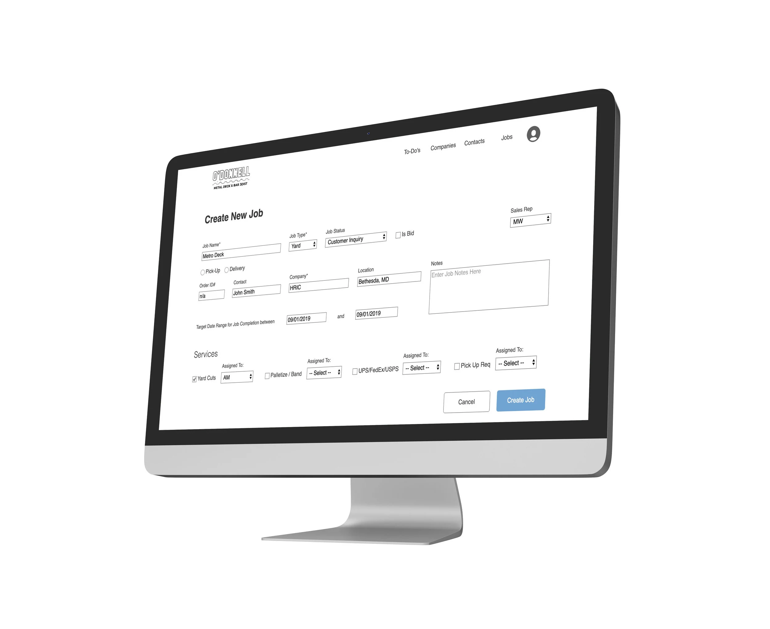
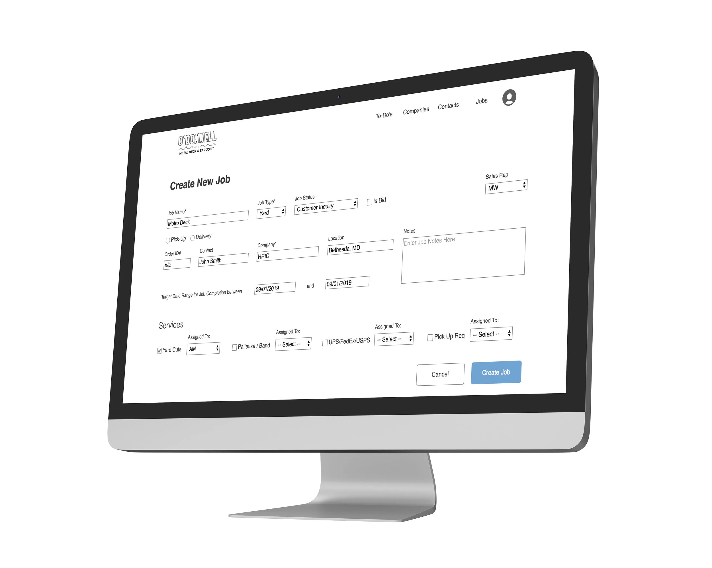
Custom-Hybrid CRM Job Record Screen
O’Donnell Metal Deck Custom Hybrid CRM
Constraint- 2 Week Design Sprint
Role- Co-UX Designer and Client Liaison in 3 person team
Scope and Deliverables- Information Architecture, Clickable Mid-Fidelity Prototype for Jobs Portion of Custom CRM, Product Roadmap
Methods- Research including Competitive Analysis, User/Stakeholder Interviews, Card Sorts, Affinity Mapping
Design- Paper Prototypes, Lo-Fidelity Prototypes in Balsamic, Mid- Fidelity Prototype in Axure
Usability Testing- 3 rounds with Users/Stakeholders as product is internal facing
Card sorting with O’Donnell’s Project Manager and President
Card Sorting and Interview Findings
Card sorting revealed consensus around mental models.
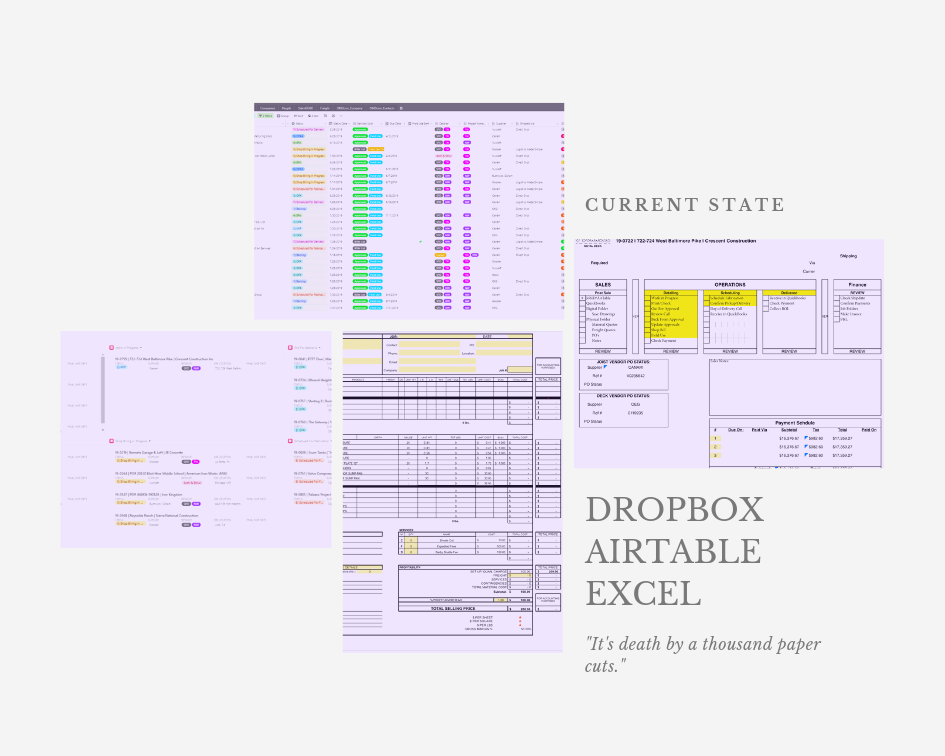
Interviews pointed to key challenges revolving around the conflicting priorities of the need for quick but thorough estimation; disparate information storage that slowed down estimating; too many tools; information handoff was cumbersome; lack of clarity around what constitutes priority for the Job Record Page in a CRM
“It’s death by a thousand paper cuts.”- Company President
Per the company president, too much time is spent moving in and out of disparate systems.
User Problem
O’Donnell’s Sales and Operations team want to keep up with the growing business, but the information about clients, services, and jobs are stored in too many different places, reducing efficiency. This makes them feel frustrated they will fall short as the business continues to grow exponentially.
Design Hypothesis
By clarifying information architecture, providing an upload feature for document storage, and offering a two click “Create Job” solution, the CRM would help O’Donnell improve workflow efficiency and increase growth capacity.
By removing Dropbox document storage and search from the workflow, the time to generate a quote would be reduced by 20%.
Paper Prototypes
Our paper prototypes employed the user interface found in O’Donnell’s partial CRM as well as best practice conventions seen in competitive analysis. We designed for the product workflow using tabs across the horizontal axis but structured the page similarly to O’Donnell’s quote records.
When we conducted user testing, there was some familiarity but also many challenges. These were primarily the result of the inaccurate placement of field names within procedural flows. For example, the Order ID # was only created after a quote had been accepted and this would indicate the inception of the “active order” stage. We also heard this:
“This is so different from how we work.”- Company President
Low Fidelity Prototypes
We tested the low-fi prototypes with the O’Donnell team and learned:
There were further adjustments needed to correctly align fields with operations and workflows.
The tabs structure required a lot of back and forth clicking for singular tasks.
Organization by stages wasn’t intuitive to users. Information architecture needed more revisiting.


